Graphing User Data
Once a user has uploaded their own data to the Webapp, that data can be vizualized using the same graphing tools that are available when graphing TCGA and/or TARGET data. However, the process for graphing user data is slightly different from how it is done with TCGA data
Important sections on the Webapp front page
The boxes in the figure below are links that are used to graph user data
Step 1: Create a Cohort from your project
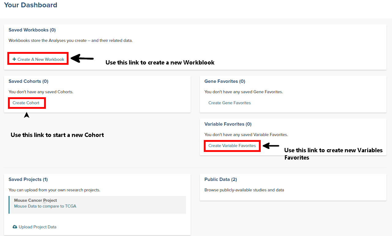
- From the front page of the Webapp, click on Create Cohort to start the process
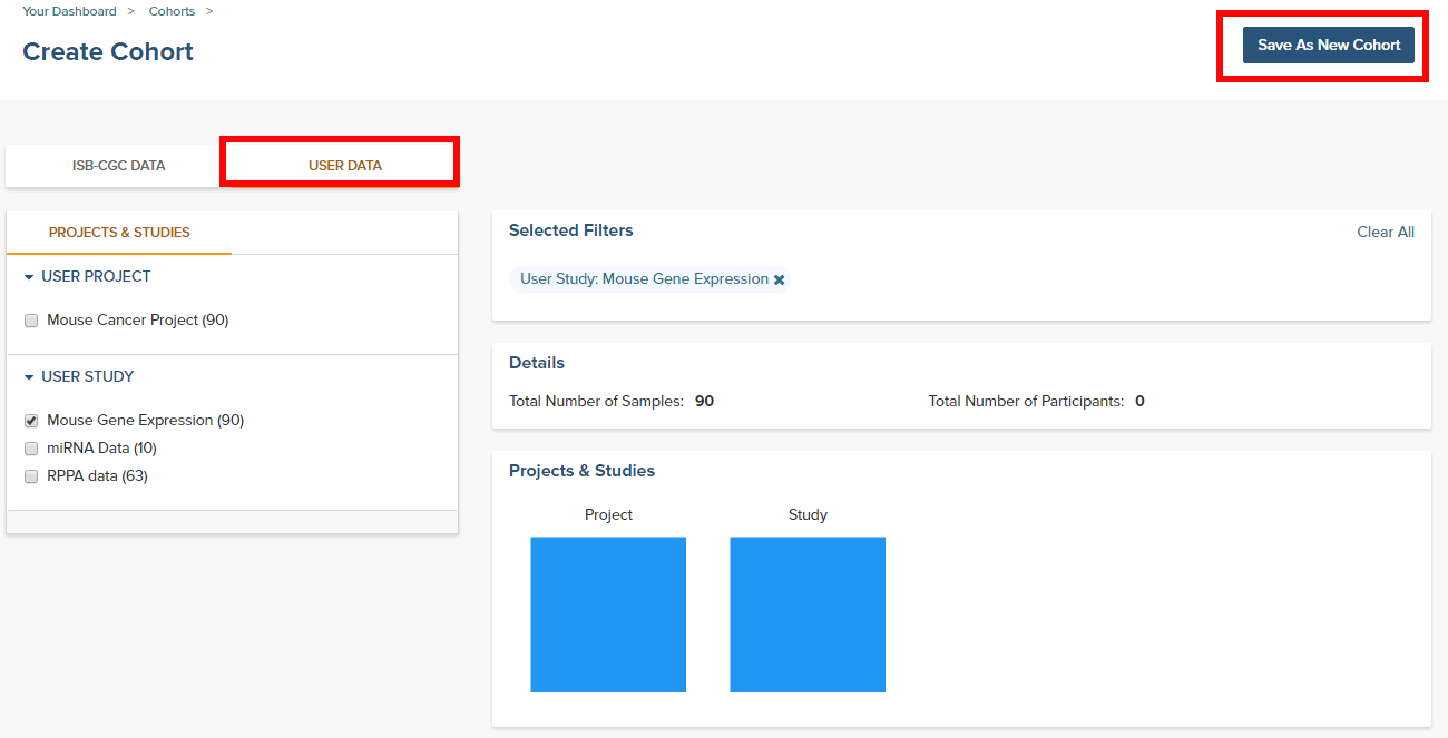
- Click on the User Data tab and select the project or study that will be the cohort
- Save as a new cohort
Step 2: Create a Variables Favorite
- From the front page of the Webapp, click on Create Variable Favorites to start the process
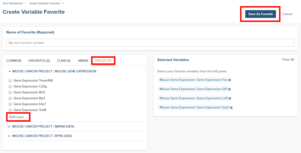
- Click on the Projects tab to see the user supplied studies
- Select the variables that will be available to graph. Note that if the study has a large number of selections, using the browser search function can help locate the item.
- Give the variables a name and click on the Save as Favorite button
Step 3: Graph the favorites in a Workbook
- From the front page of the Webapp, click on Create a new Workbook
- Under the Source Data heading, select the Variables and Cohorts that you wish to use in the graph. In each case you will be brought to a page listing all of the available Variables or Cohorts. Simply select the desired ones and then click the Add to Workbook button
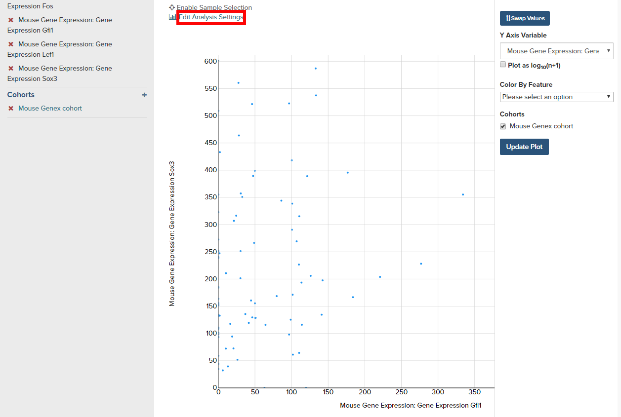
- Under the Analysis Type heading, select the appropriate graph type. This will cause a window to slide in from the right.
- Fill in the X and Y axis variables, select a variable to use for coloring and finally select the cohort to use.
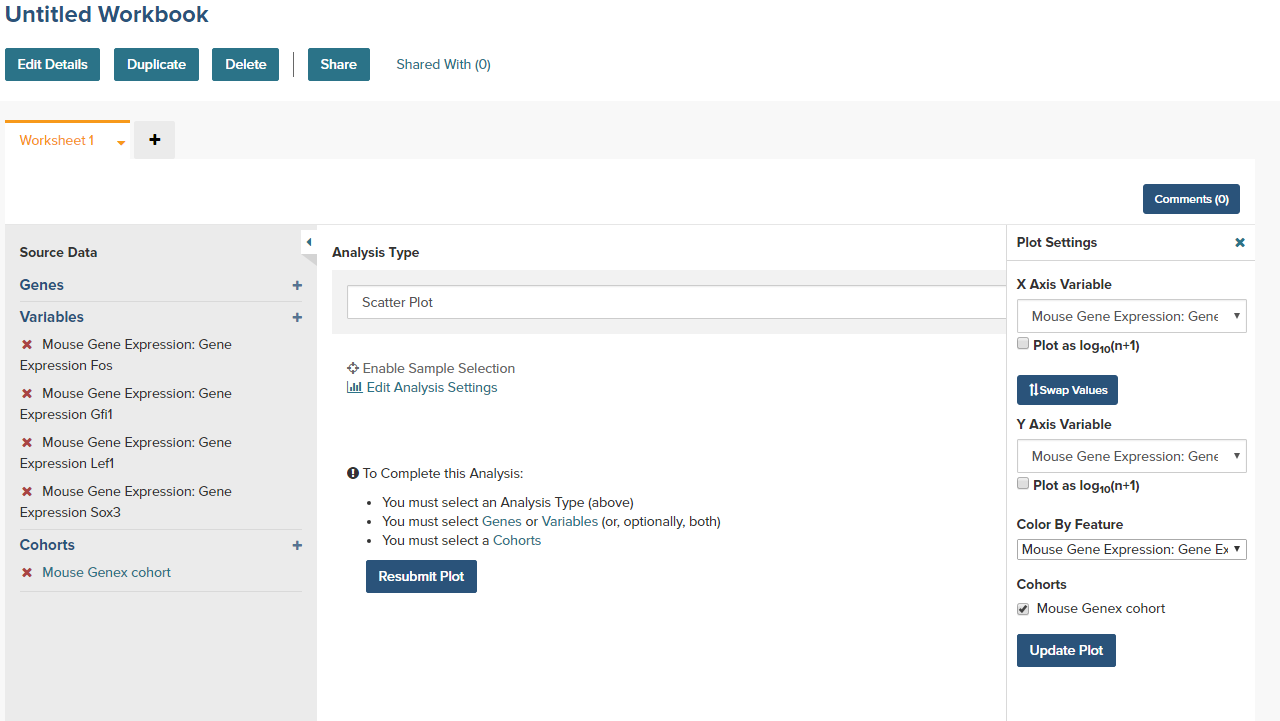
- Click on the Update Plot button to have the system gather the data and generate the plot.
- If changes need to be made to the plot, click on the Edit Analysis Settings link to bring back the graph dialog box.